Tuesday, July 26, 2011

SCOTTY REIFNSNYDER ON THE COVER OF COMMON GROUND MAGAZINE

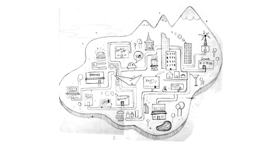
 We are very excited to see Scotty Reifsnyder’s work featured in the recent issue of Common Ground Magazine! Scotty’s colorful work looks amazing on the cover and throughout the article Common interests, Common communities. We are pleased to share some of the process resulting in these striking images, as we have a couple of the artist's initial sketches. Scotty says that both sketches were ideas for the front cover, but the client liked them so well that one of them was used with the article inside the magazine. Check out the final images and the sketches below!

Wednesday, July 20, 2011

ONTARIO PLACE AD CAMPAIGN BY RYAN SNOOK


WOW! | Ontario Place from Ryan Snook on Vimeo.

IMAX | Ontario Place from Ryan Snook on Vimeo.


"The process of working with the animation studio, Cuppa Coffee was particularity interesting, as it was the first time I've been involved in animation. I worked as the designer creating all the characters and settings, but collaborating with the people I was working with helped take take my ideas to better places. Also on the print side of things, working directly with the agency Draftfcb was wonderful, they understood my work and how to use it. All in all a fantastic campaign to be a part of.

Oh and I also got a tour of the park in order to better illustrate some of the features, one of the interesting things to happen during the process."

-Ryan Snook

Thursday, June 30, 2011

BIENVENIDO EVA VAZQUEZ!

We are thrilled to present one of our newest artists, Eva Vazquez, who lives and works in Spain. It is rare to find an artist who can create a successful marriage between high concept and exquisite aesthetics. Her distinctive palette and fresh style make Eva the perfect choice to create unique art for your next editorial project.

CLICK HERE TO VIEW MORE WORK FROM EVA VAZQUEZ'S PORTFOLIO 

Monday, June 13, 2011

NIGEL BUCHANAN ANIMATES THE JUNGLE BOOK FOR THE IPAD


"The process took around 4 months, in between servicing regular clients. Drew Frist from Electric-Type, the creative director on the project, broke down the areas to be illustrated and described how he had imagined them to be. In conjunction with Dino, the interactive company, he would give me a list of 'assets' which are all the bits needed in separate layers for the animations. After the first few we got to the stage where he would leave me to produce the final image without having to approve the sketches, which sped up the whole process.

It was a lot of work, but the whole exercise was relatively seamless. Drew and Dino where great to work with. We used a central work base called Basecamp which held all the correspondence between all parties and all the files in one place.

I was very keen to take this on, as I can see that this area of getting our illustrations animated is only going to get bigger and I was excited to see what was involved."

-Nigel Buchanan

Monday, June 6, 2011

SHAW NIELSEN MAPS OUT DINING HOT SPOTS FOR THE UNIVERSITY OF DENVER

This map of Denver was created for the University of Denver Alumni Magazine to highlight the growing number of gastronomic delights owned by DU alumni.


The final file was left layered so that the designer could pull out various elements of the map to feature as spot illustrations throughout the article.


 CLICK HERE TO VIEW MORE WORK FROM SHAW NIELSEN'S PORTFOLIO

Friday, May 13, 2011

10 RAPP ARTISTS SELECTED FOR THE COMMUNICATION ARTS ILLUSTRATION ANNUAL!

In our humble opinion, the Communication Arts illustration annual is the most prestigious of the juried competitions. The readership and jurors represent all the facets of the communication community, and actual assignments are a frequent result. With that in mind, we are extremely proud to announce that ten of our artists were selected for this year's annual, in virtually every category except animation. While each illustrator has a decidedly unique style, they all share a commitment to quality and originality. It is a true honor to be associated with such an extraordinarily talented group. Below we have listed the artists by category, with links to the artists' portfolios. When you have a few moments, please take a look. Enjoy!

CATEGORY: EDITORIAL
DAN PAGE, ILLUSTRATOR | RANDY WATSON, ART DIRECTOR | VANCOUVER, CLIENT

CLICK HERE TO VIEW DAN PAGE'S PORTFOLIO 
ASAF HANUKA, ILLUSTRATOR | AMIR ZIV, ART DIRECTOR | CALCALIST WEEKEND EDITION, CLIENT

HARRY CAMPBELL, ILLUSTRATOR | SOOJIN BUZELLI, ART DIRECTOR | PLANSPONSOR, CLIENT

 CLICK HERE TO VIEW HARRY CAMPBELL'S PORTFOLIO


CATEGORY:  ADVERTISING
ANTHONY FREDA & DANIEL J. ZOLLINGER, ILLUSTRATORS | CHRIS VON ENDE, ART DIRECTOR | MIKE WARD, WRITER | DAVE LOEW/ JOHN WYVILLE, CREATIVE DIRECTORS | SUSAN CREDLE. CHIEF CREATIVE OFFICER | LEO BURNETT CHICAGO, AD AGENCY | GIRL SCOUTS OF AMERICA, CLIENT


CLICK HERE TO VIEW ANTHONY FREDA'S PORTFOLIO 

CATEGORY: INSTITUTIONAL
JON REINFURT, ILLUSTRATOR | TRIPP UNDERWOOD, ART DIRECTOR | CHILDREN'S HOSPITAL BOSTON, CLIENT

CLICK HERE TO VIEW JON REINFURT'S PORTFOLIO 

CATEGORY: BOOKS
JEFFREY SMITH, ILLUSTRATOR | NORMA TENNIS, DESIGNER | KAREN CROFT, CREATIVE DIRECTOR | DAVID TALBOT, CHIEF CREATIVE DIRECTOR  | THE TALBOT PLAYERS, DESIGN FIRM | SIMON & SCHUSTER, PUBLISHERS.


CLICK HERE TO VIEW JEFFREY SMITH'S PORTFOLIO 

CATEGORY: UNPUBLISHED
MARC ROSENTHAL, ILLUSTRATOR | CHRIS CURRY, ART DIRECTOR

CLICK HERE TO VIEW MARC ROSENTHAL'S PORTFOLIO 

CATEGORY:  SELF PROMO
SHAW NIELSEN, ILLUSTRATOR | ELYSIA SYRIAC, ART DIRECTOR | AIGA COLORADO, CLIENT

CLICK HERE TO VIEW SHAW NIELSEN'S PORTFOLIO 

CATEGORY: FOR SALE
SCOTTY REIFSNYDER, ILLUSTRATOR | THE HEROES OF FOLK, SERIES

CLICK HERE TO VIEW SCOTTY REIFSNYDER'S PORTFOLIO 

Thursday, May 5, 2011

MARTIN ANSIN ILLUSTRATES THE IMPORTANCE OF LIBRARIES TODAY


This piece was assigned to Martin by Kevin Henegan of Library Journal, who wrote:
   
"The author being depicted on our cover is John Scalzi, a popular sci-fi writer. His new book is called Fuzzy Nation, with a sci-fi character Fuzzy that’s been retooled from a 1960s book that was in the public domain. We want to get in the sci-fi genre vibe, but not go so heavy duty painterly to ape sci-fi book cover art too much.
Ansin’s work is a good blend of graphic novel realism with a simpler punchy energy. He’s also adept at rendering real-life people—and  we’ve got to present Scalzi and his character Fuzzy with enough similarity to what they really look like. Getting a sense of the sci-fi realm in without being too specific will also come into play in an interesting way."

Ansin adds: 

"This was a difficult job to approach at first, as there were many things that the editors of the magazine wanted to express in the cover. We needed most of all to spotlight Scalzi  and work with the idea of his writing transforming an existing character that may not be known to many people. We also wanted to show the debate in his "appropriation" of this character and the book that inspired him to write his version, along with the author's opinion on ebooks and the importance of libraries."


Click on the link below to view more of Martin Ansin's work:
MARTIN ANSIN'S PORTFOLIO